Naming | Identity & Branding | Packaging | Art Direction
Dosa has been doing the rounds on plates for generations—crispy, golden, universally loved. But what happens when you take that iconic comfort food and flip it? Enter: Daily Dosa.
This brand doesn’t just serve dosa—it reimagines it. From flavour to format, they’re on a mission to reinvent the way we eat this beloved classic. Think Dosa Tacos. Dosa Cones. Think Tambda Rassa instead of the usual sambar. Still sounds like home, but with a twist that makes you look twice.


Before the identity, came the name. With a menu full of reinvented classics and unexpected flavour pairings— this wasn’t just about serving dosa. It was serving it differently every time.
That’s where the name Daily Dosa was born. A name that captured both the comfort of routine and excitement of variety. Because when dosa comes in this many forms and flavours, why wouldn’t you want to have it every day?

For a brand reinventing one of the most loved South Indian dishes, the identity needed to feel just as bold, playful, and deliciously familiar as the dosa itself.
The starting point? Batter. Specifically, the way it is poured onto the pan in a swirl. That became the core idea behind the visual identity. The logotype takes inspiration from that flow—soft edges, gentle curves, and merging letterforms that echo the fluid motion of dosa batter being poured.


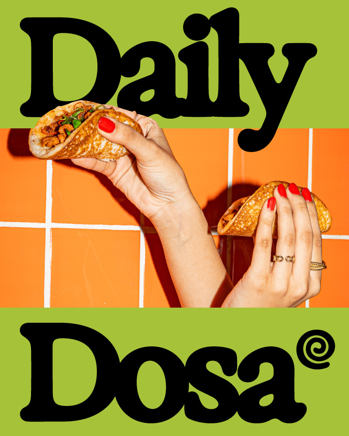
Supporting this form is a colour palette that grabs attention—vibrant orange and green bring in both energy and appetite. Together, they help Daily Dosa stand out in a busy QSR space, while nodding to the freshness and variety of its menu.
We took the spirit of dosa—familiar, versatile, and full of potential—and cooked it into every design decision. From Dosa Tacos to Dosa Cones, the menu breaks tradition in the best way—and the identity follows suit, turning a classic into a contemporary, everyday experience.


